The Chinese University of Hong Kong (CUHK) has halted the use of a controversial branding refresh following criticism from alumni and lawmakers.
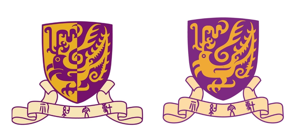
The redesign, marking the institution’s 60th anniversary next year, included a simplified version of a split-colour Chinese phoenix. CUHK said it was “clearer, more distinctive and dynamic” and in-keeping with modern design trends which make it more legible online.
“CUHK is going to discuss the matter in tomorrow’s council meeting,” a spokesperson told HKFP, in reference to a meeting of the university’s ruling body on Tuesday.
Phoenix to ‘pheasant’
University council member and legislator Bill Tsang said last week that management had acted hastily with the redesign, as he called for further consultation, according to RTHK. Tsang added that the old two-colour concept references the Chinese concept of yin and yang, describing interconnected forces. Lawmaker Tommy Cheung also said the change lacked transparency.
Netizens and students compared the new rendering of the golden mythical bird to a “pheasant.”

In an announcement last Thursday, Vice-Chancellor Rocky Tuan said CUHK was listening and had “received valuable feedback from across our community of staff, students, alumni and members of the general public.” He added that the changes would not be rushed.
Support HKFP | Policies & Ethics | Error/typo? | Contact Us | Newsletter | Transparency & Annual Report | Apps
Help safeguard press freedom & keep HKFP free for all readers by supporting our team


LATEST FROM HKFP


HKFP has an impartial stance, transparent funding, and balanced coverage guided by an Ethics Code and Corrections Policy.

Support press freedom & help us surpass 1,000 monthly Patrons: 100% independent, governed by an ethics code & not-for-profit.