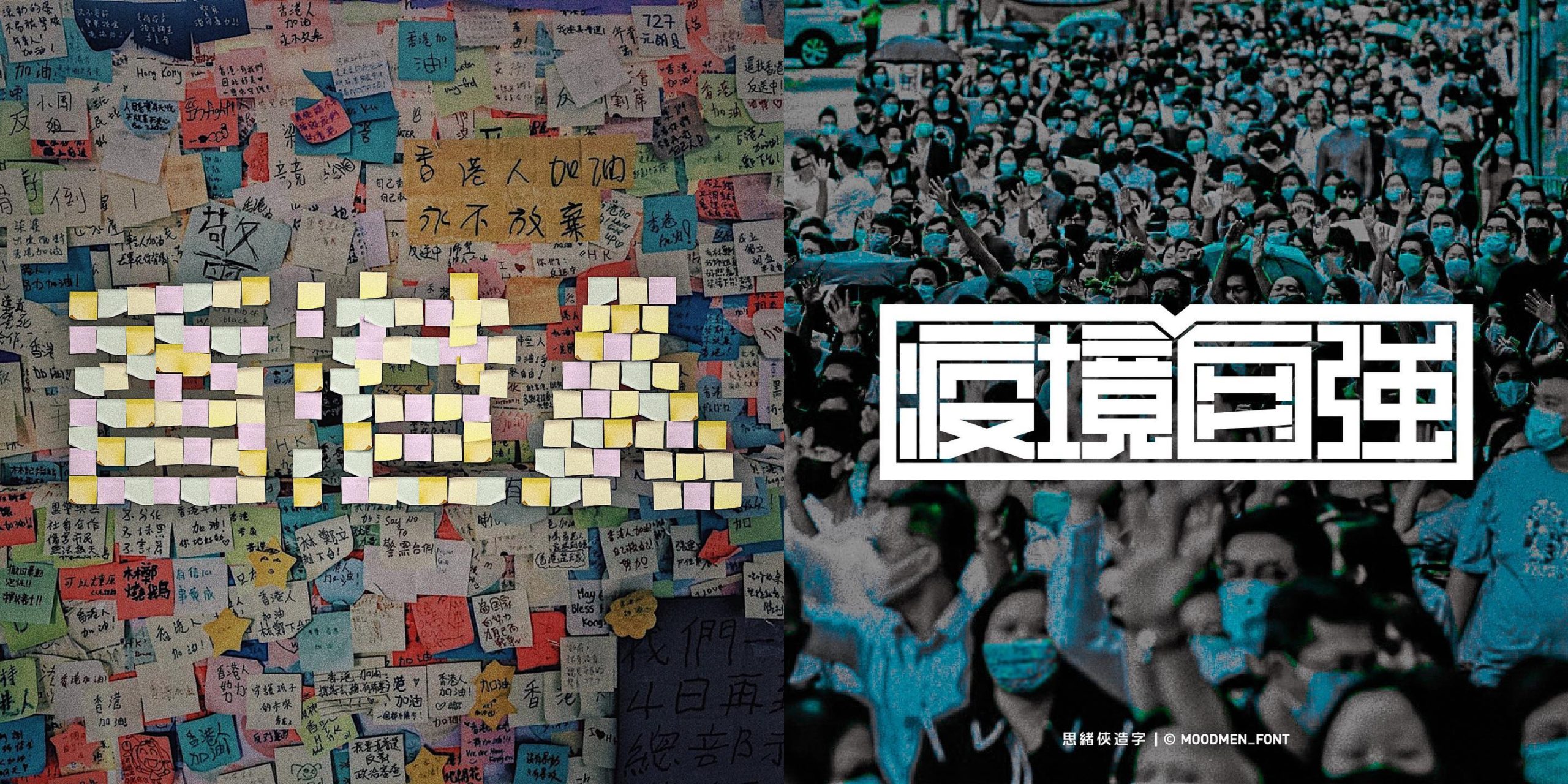
With his latest creation, Reborn Font, Hong Kong font designer Roy Chan wants to “reawaken the toughness of the past.”
Based on Serif and Sans-Serif fonts, Chan’s design features strong strokes and sometimes sharp corners, through which the 25-year-old hopes to create traditional Chinese characters that can act as a rallying cry.

“I think the problem is that Hong Kong lacks a font that has the impact of a rallying cry or a lot of character, which was much needed when we began the project in 2020, as there was a strong sense of powerlessness at the time,” said Chan.
“Whether it was the protest movement or the pandemic, people were left feeling feeble no matter what they did.”
But Reborn Font is far from feeble. Bold and punchy, it features characteristics such as horizontal strokes that end with a hook and right-to-left strokes with rounded corners, which are integral to its design and its essence.
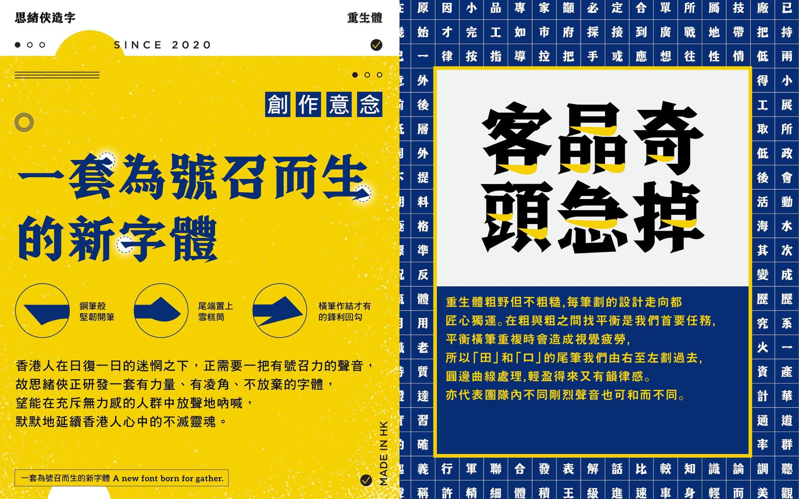
“In the square, every stroke has its purpose, there are a lot of sharp edges and corners. The different strokes, and an attempt to make them ‘agree to disagree,’ symbolise a city that is home to many different people with voices. Some will be more extreme, but there are always some people mediating in the middle – that’s what the right-to-left strokes with rounded corners signify,” Chan said.

“As for the horizonal strokes that end with a hook, [they symbolise that] if people continue to attack us from the outside when we are already trying hard to survive within the square, then we will break out from the square, defend ourselves and fight back to stop their attacks.”
The beginning of Moodmen
Chan was working at an advertisement agency when he first began designing his own fonts, something that happened almost by accident.

“In graphic design, there are several key components, such as fonts, typesetting, and Photoshop editing. Of these components, apart from being relatively good at using Photoshop to edit photos, I’m quite weak at typesetting and choosing colours,” said Chan.
“It was because I wasn’t good enough at those other things that I decided to try my hand to designing fonts.”
With plenty of spare time, Chan began learning how to create fonts, starting with Japanese characters and later moving onto Chinese characters.

“The company I worked for back then was an old-fashioned agency with a lot of partitions in the office… No one really knew what you were doing in your seat,” said Chan. “Coincidentally I was in a new team and I didn’t have much to do.”
The first designs Chan posted on his personal Instagram account were Moodmen and Almightymen. It was after seeing them that a friend encouraged him to set up a new page for his creations.
In 2020, after earning some money from the sale of his first calendar, Chan founded his own company, called Moodmen Font after one of his first creations, and began working full time as a font designer.
Resisting washouts
In January, Moodmen Font launched a crowdfunding campaign to raise HK$1 million for Reborn Font, with the goal of publishing designs for more than 5,000 traditional Chinese characters that Chan hopes to conserve.
As well as its unique design, Reborn Font also features words that are only used in Cantonese.
“If you say that it does not matter whether it is traditional or simplified Chinese characters as long as people can understand it, then you’re not really a Hongkonger… If you think like that, you’re not one of those defending traditional Chinese characters.”
The font designer hoped to appeal to those who use traditional Chinese characters.
“You don’t have to be especially proud of it, but when it’s your mother-tongue, such as Cantonese, when there are cultures that you don’t want to see disappear, you have to do something to defend them.”
“I think simplified Chinese characters diluting traditional characters, or Mandarin diluting Cantonese, these are all upcoming trends in the future. We don’t want to see these trends becoming more popular, that’s why we do what we can.”
‘A complicated era’
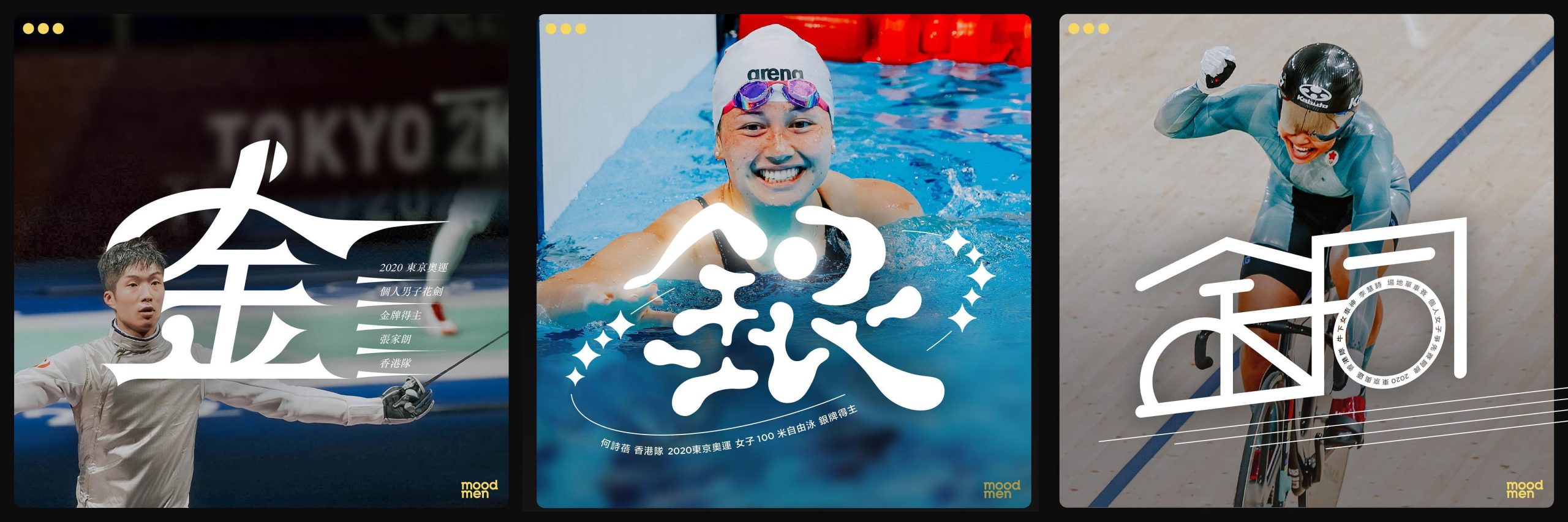
To date, Moodmen Font has published hundreds of designs, many of which were linked to specific social events, including Hong Kong’s historic wins at last year’s Toyko Olympics, as well as the 2019 anti-extradition bill protests.
However, following the enactment of the Beijing-imposed national security law and the increasing number of charges brought under the colonial-era sedition law, Chan described the times as “complicated.”
“Living in such a complicated era… there is risk doing anything,” Chan said.
“If you ask whether I will stop doing something because of certain laws, I don’t have a specific feeling because I’m not creating to break laws.”
Reasons to stay
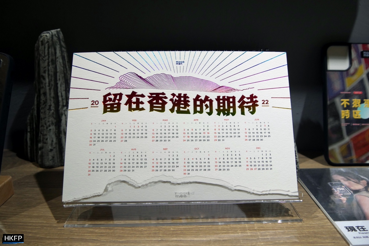
For the past three years, Moodmen Font has created calendars, each with a different theme and 12 quotes, one for each month.
For Chan, each calendar’s design exemplified not only how he was feeling about Hong Kong at the time, but people’s reactions to the calendars also reflected how connected his designs were to the city.
The studio’s first calendar, for 2020, was titled “The resignation of being born in Hong Kong.” In 2021, it was “Guarding Hong Kong across the shore.”

Trying to break with the gloomy themes, this year, Moodmen came up with “The anticipation of staying in Hong Kong,” employing the new font. But compared with the previous years, the reception to this year’s calendar has not met Chan’s expectations.
“For whatever reason, when I was frustrated in the past two years, people still had hope. But now that I feel hopeful, people feel like there is nothing to salvage,” Chan said. “I feel like our creations have lost their connection to the people here.”
However, the was not merely a question of Moodmen being out of touch.
“Over the past few years, pessimism brought a sense of resonance. But when I was creating [the calendar] this year, I thought: ‘it is tough to survive under despair. If you’re so pessimistic, you would leave.'”
“So if I have to stay, I might as well spend my days more positively.”
Fonts for Hong Kong
Chan’s creations were for two groups of people: those who cannot leave, and those who chose to stay, “I want to tell these two groups of people that that there is nothing wrong with their choice.”

The 25-year-old said he decided to stick around, as this is a time where he can “best release” his creation.
“It’s easy to leave, but if I leave, I won’t be able to give as much. Of course, I would still be able to contribute, but I can do so more directly if I stay here.”
“Reborn Font is a contribution of some sort… leaving a new set of fonts here will definitely help Hong Kong, that’s why I’m doing this first and thinking about my future later.”
Support HKFP | Policies & Ethics | Error/typo? | Contact Us | Newsletter | Transparency & Annual Report | Apps


Help safeguard press freedom & keep HKFP free for all readers by supporting our team


HKFP has an impartial stance, transparent funding, and balanced coverage guided by an Ethics Code and Corrections Policy.

Support press freedom & help us surpass 1,000 monthly Patrons: 100% independent, governed by an ethics code & not-for-profit.